It turns out there is only a handful of figures on the instrument knowledge test that:
- Are likely to be asked about, and
- Could be easy points on the test.
These are the 10 figures I believe are worth a closer study.
Weather
Ah, weather. I love weather, and the examiners seem to as well. These three weather figures are the most important to know for the instrument knowledge test.
Figure 2: Wind and Temperatures Aloft Forecast
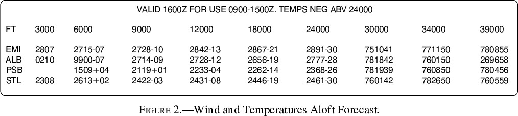
A favorite for gotcha questions, this figure will almost certainly make an appearance. Here are a few questions to test your knowledge.
What are the three pieces of information encoded in DDff+TT?
- DD = Wind Direction (true, not magnetic))
- ff = Wind Speed (kts)
- TT = Temperature (°C)
Why is PSB @ 3000′ empty?
The lack of forecast indicates the airport elevation is within 1500’ of 3000’.((The actual elevation (not shown on this figure) of PSB is 1,948’.))
Why does EMI @ 3000′ have no temperature?
Temperature is not forecast @ 3000′ or when the airport elevation is within 2,500’.
What does 9900 mean for ALB @ 6000′?
Light/variable winds of less than 5 knots.
How do you interpret 751041 for AMI @ 30000′?
- 75 – 50 => 250° Wind Direction (true)
- 10+100 => 110 Wind Speed (kts)
- 41 => -41°C (temperatures above 24000′ are negative, as noted above the figure)
Did anything above catch you by surprise? The best resource to brush up on this topic is Aviation Weather Services Ch. 5.
Figure 7: High-Level Significant Weather Prognostic Chart
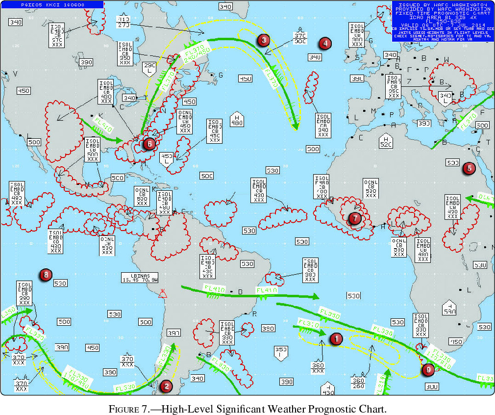
The high-level prog chart will almost certainly have a dedicated question. Let’s dive in.
What is the bottom of the forecast range? (This is also the meaning of XXX on the chart.)
FL250, which can be found in the upper-right information box.
What does area ❶ show?
An area of moderate turbulence from FL360 to below FL250 (since XXX means below chart range).
What is the difference (besides the base height) between area ❸ and area ❶?
Area ❸ is severe turbulence, while area ❶ is moderate.
Note: I’ve skipped area ❷ since it’s similar to area ❶.
Areas ❹, ❺, and ❽ all show the same thing. What is it?
The tropopause height. Area ❽, for example, shows a tropopause height of FL530.
How do you interpret the forecast weather at area ❻?
- Cumulonimbus clouds (CB)
- ½ to ¾ coverage (OCNL)
- Embedded (EMBD)
- Tops = FL450
- Bases below FL250
Area ❼ is similar, but not embedded and with higher tops.
What is the green arrow near area ❾? How do you interpret the flags and info box (FL330; 110/610)?
- Area ❾ is a jet stream
- Flags show a speed of 170kts
- Infobox shows the maximum speed is at FL330, and the base/top of the 80kt wind field is FL110/FL610.
Looking for more information? Aviation Weather Services Ch. 5 is the best resource for this figure.
Figure 261: Graphical Forecast for Aviation
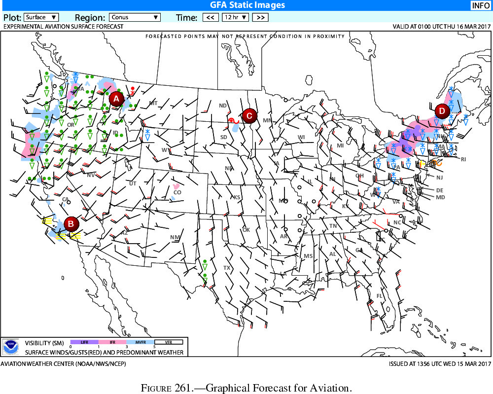
This weather figure is a favorite of mine. Not only is it wonderful for preflight, it always adds a dose of schadenfreude to the day.1
Depending on your home state, some of these symbols may be new to you. Let’s review what we have in this figure.
What is shown near area A? What wind is forecast directly below?
- Heavy rain to the west and light rain/snow to the east (in red).
- Wind from the southwest at 15kts gusting to 20kts.
What is shown near area B?
Fog.
What is shown near area C?
Light freezing rain to the west.
What is shown near area D?
Light snow showers and gusty wind.
(Bonus) What is the orange symbol near New York? What about the yellow symbol new New Jersey?
- NY in orange: Light freezing drizzle.
- NJ in yellow: Blowing snow.
Want to know more? I found the weather symbols guide, GFA user guide, and wind barbs overview most useful. And don’t forget the visibility (LIFR -> VFR) legend at the bottom of the figure!
Instrument Interpretation
Instrument interpretation is the second of the three fundamental skills for instrument flight. (Do you remember the other two?2)
These are the instrument knowledge test figures I found most useful to study.
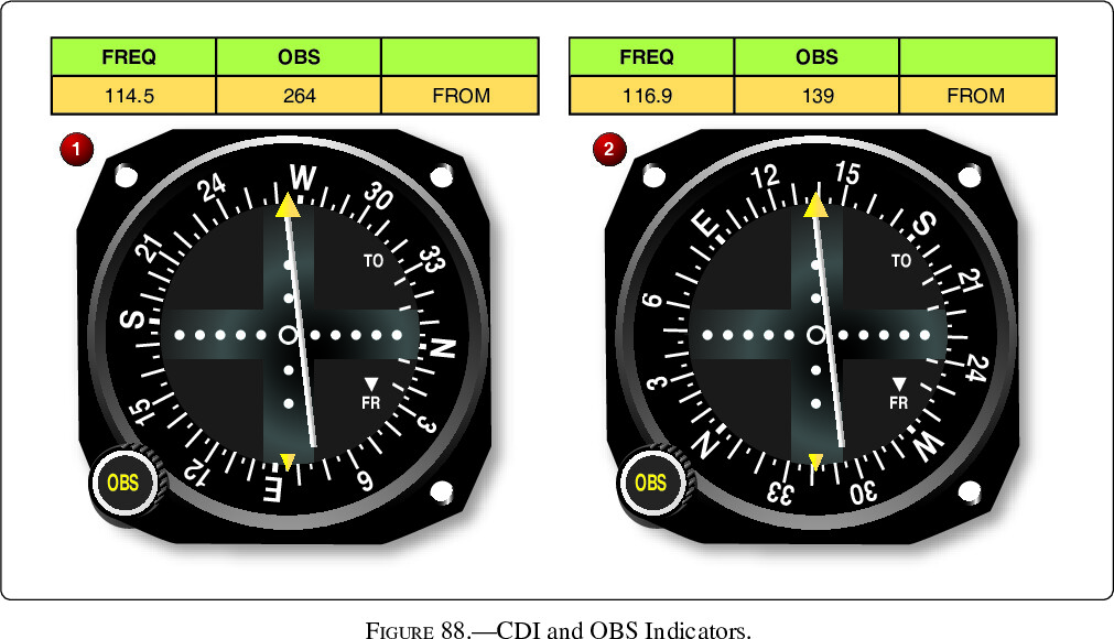
Figure 87/88: CDI/OBS Indicators with IFR Chart
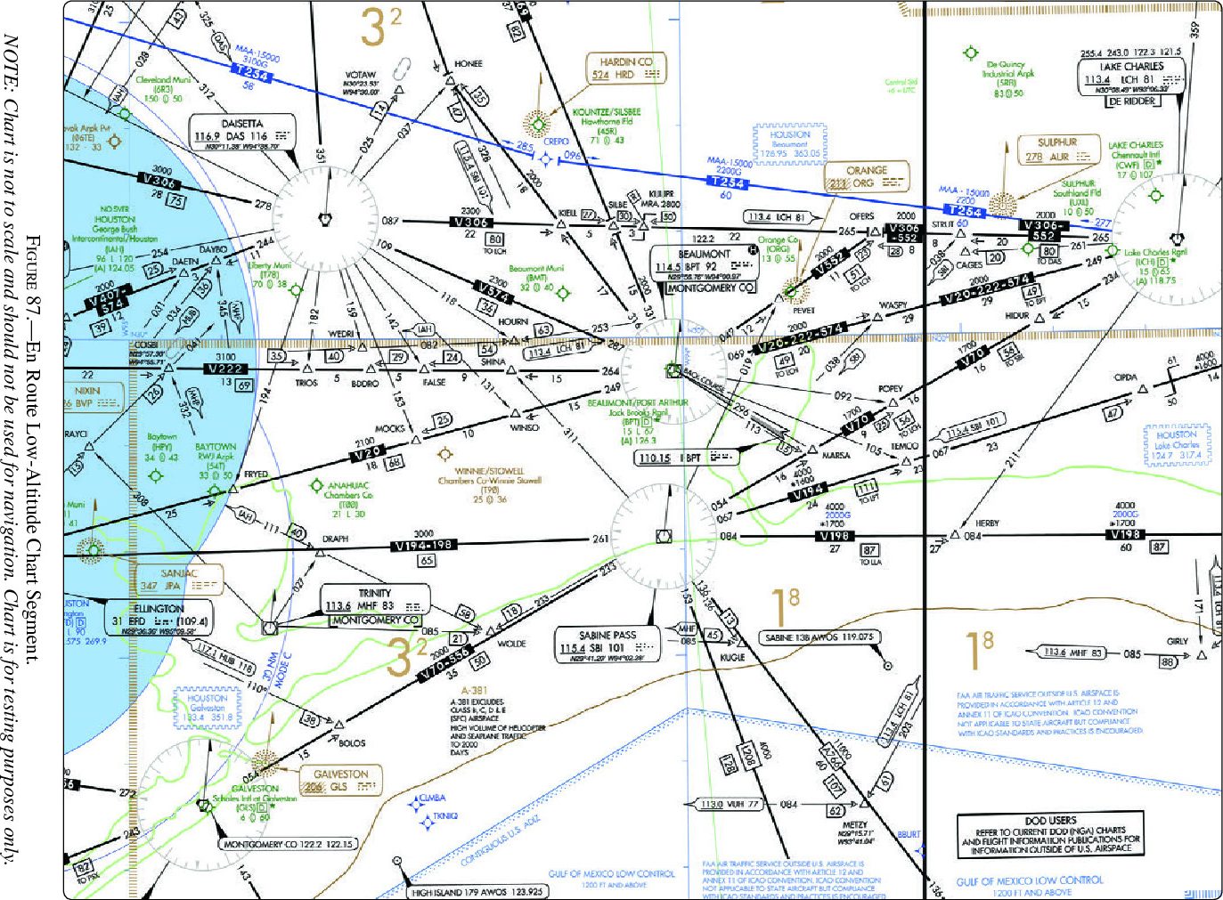
This figure is an example of a “where is the aircraft?” type of question. By interpreting the instruments, you should be able to determine your location on a chart.
Figure 87: En Route Low-Altitude Chart Segment
This particular IFR Chart covers a lot of distinct icons: localizer back course, change over points (COP), minimum reception altitude (MRA), and more.
That said, I won’t spend more time on them here since the icons’ meanings are available in Appendix 1, Legend 34 (IFR En Route Low Altitude).
Figure 88: CDI and OBS Indicators
Course deviations indicators (CDIs) show angular deviation from a selected course.
What deviation and direction are shown on the CDIs? (No need to reference Figure 87 yet.)
Both CDIs show a 1/2 dot deflection, which indicates the aircraft is 1° off the selected course. They also both indicate FROM, meaning we are outbound from the VOR along the selected radial.
Now let’s include Figure 87. Notice that CDI ❶ is tuned to the BPT VOR/DME, and CDI ❷ is tuned to the DAS VORTAC.
Where is the aircraft in relation to V222?
Radial 264 is selected on CDI ❶, which defines V222. CDI deflection shows we are south of V222.
Where is the aircraft in relation to FALSE?
Radial 139 is selected on CDI ❷. Although this radial is not explicitly charted, since the aircraft is south of V222, we know it is east of FALSE.
Trouble reading the CDI figure? Instrument Flying Handbook Ch. 9 has good information.
Or if you prefer more help on the IFR Chart, check out Appendix 1, Legend 34 (IFR En Route Low Altitude), Instrument Procedures Handbook Ch. 2, or Instrument Flying Handbook Ch. 1.
Figure 96/97: HSI for a Localizer
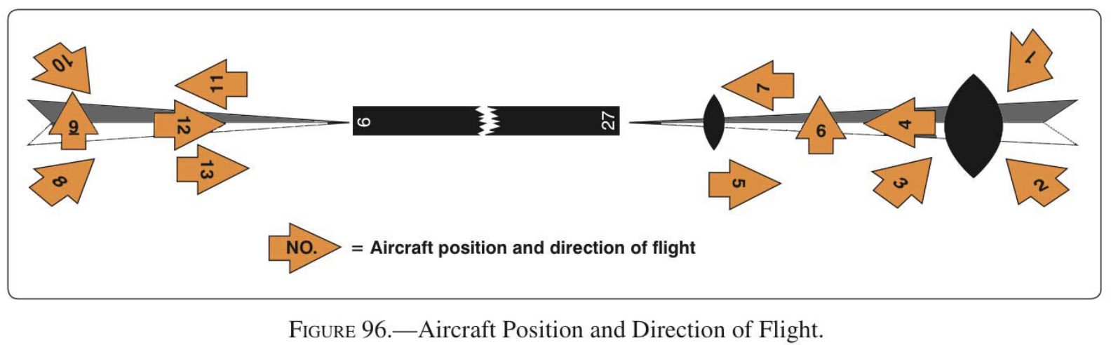
These figures cover localizers, horizontal situation indicators (HSIs), and reverse sensing.
When used with localizers,3 HSIs don’t suffer from reverse sensing if the front course is set. In other words, by setting the front course (270° in this case), the needle correctly indicates the aircraft’s position even when on the back course.4
However, several HSIs here are set to the back course (090°). Imagine rotating those by 180° to visualize where the localizer is relative to the aircraft.
What aircraft of Figure 96 does each HSI in Figure 97 correspond to?
- (A) Aircraft heading N and on localizer => Fig. 96, #6 or #9
- (B) [Reverse Sensing] Aircraft heading E, south of localizer => Fig. 96, #5 or #13
- (C) [RS] Aircraft heading E, on localizer => Fig. 96, #12
- (D) [RS] Aircraft heading NW, south of localizer => Fig. 96, #2
- (E) [RS] Aircraft heading NE, south of localizer => Fig. 96, #3 or #8
- (F) Aircraft heading W, on localizer => Fig. 96, #4
- (G) Aircraft heading W, north of localizer => Fig. 96 #7 or #11
- (H) Aircraft heading SW, north of localizer => Fig. 96, #1
- (I) [RS] Aircraft heading W, north of localizer => Fig. 96, #7 or #11
Did you skip over that last one because it’s a huge pain? I get that. At least try (D), (G), and (I).
- (D) [Reverse Sensing] Aircraft heading NW, south of localizer => Fig. 96, #2
- (G) Aircraft heading W, north of localizer => Fig. 96 #7 or #11
- (I) [RS] Aircraft heading W, north of localizer => Fig. 96, #7 or #11
If you’re looking for more, this VOR article covers localizers and reverse sensing well. You may also want to review the Instrument Flying Handbook Ch. 9.
Figure 144: Turn-and-Slip indicator
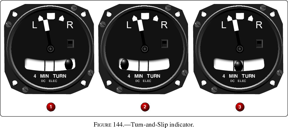
This one is straightforward, and a good one to test your vocabulary.
Are these turns standard rate?
No, they are only half standard rate.
Which is a skidding turn?
❶ — the ball is opposite the turn.
Which is a slipping turn?
❷ — the ball is on the turn side.
Which is a coordinated turn?
❸ — the ball is centered.
Check out Instrument Flying Handbook Ch. 4 for more background.
Figure 146: Instrument Sequence (System Failed)
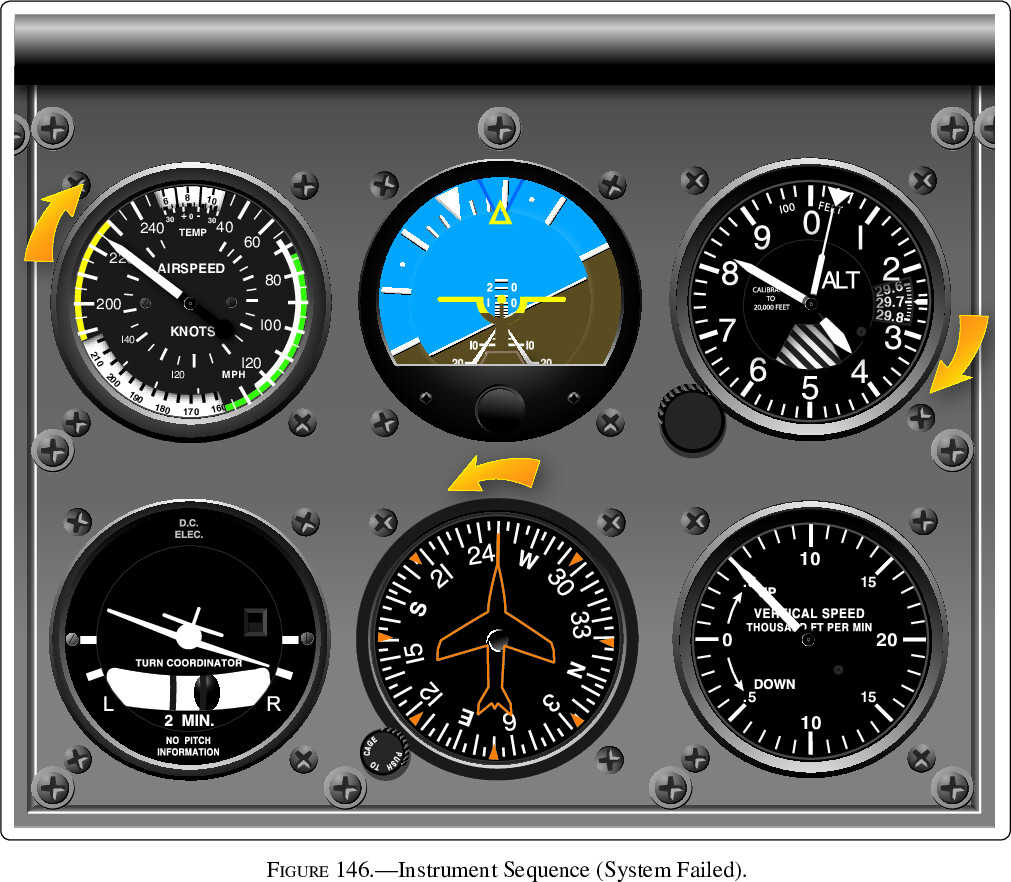
This type of figure hints at the first fundamental skill of instrument flight: cross-check. It requires you to think about the systems behind each instrument to determine which is broken. After identifying the broken system, the figure can be used to test unusual attitude recovery.
Here’s a general approach for these figures:
- Start with the attitude indicator, the rate-of-turn indicator, and the vertical speed indicator (VSI).
- Two show bank (attitude/rate-of-turn), two show pitch (attitude/VSI), and all three are based on a different system (attitude=vacuum, rate-of-turn=electrical, VSI=static).
- By comparing the attitude indicator with both rate-of-turn and VSI, you can identify which instrument disagrees.
- Next, identify if it’s a system failure or a single instrument failure.
- If several instruments of a single system disagree, that whole system may be impacted.
- If only a single instrument disagrees, that may be the only failure.
- After determining which systems and instruments to trust, recover the aircraft from the unusual attitude.
What system has failed?
- Attitude indicator, rate-of-turn indicator, and VSI all agree, meaning it’s unlikely a failure of vacuum (attitude), electrical (rate-of-turn), or static (VSI) system.
- Attitude, increasing altitude, and VSI all agree on a climb; attitude, heading, and rate-of-turn all agree on a right turn.
- Airspeed does not agree with the others:
- If the pitot tube and drain hole were blocked, airspeed would act as an altimeter, which is what we see here. We should see the other instruments behaving correctly, as they appear to be.
- If the static system were blocked, we would see the altimeter freeze in place.
- Therefore, the pitot tube and drain hole are blocked.
What is the aircraft’s attitude?
Climbing in a right turn.
How should you recover?
In order: add power, lower the nose, and bring wings to level.
Looking for more information? Check out Instrument Flying Handbook Ch. 7.
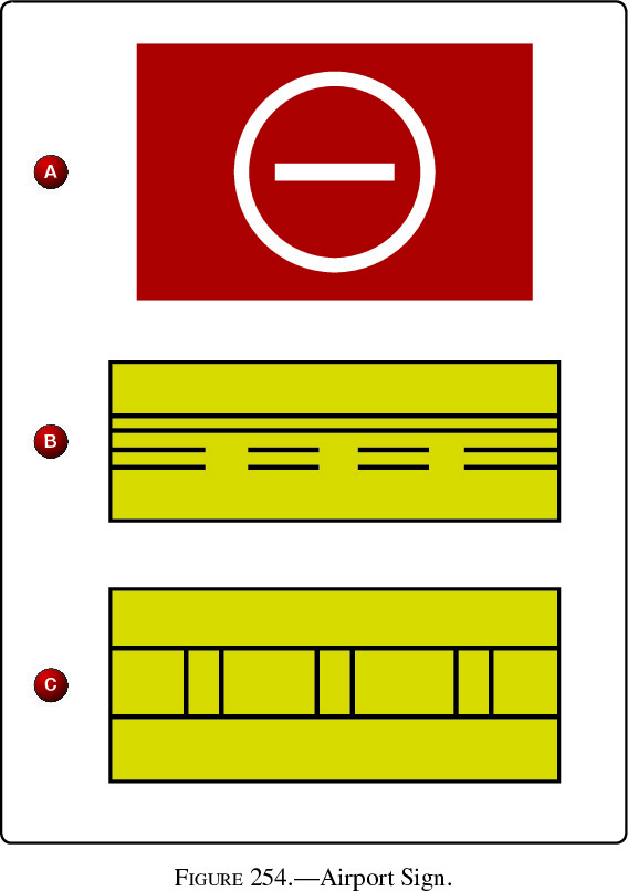
Airport Signs
Airport signs show up in several figures of the instrument knowledge test, and most are simply about memorization.
Figure 94: Application Examples for Holding Positions
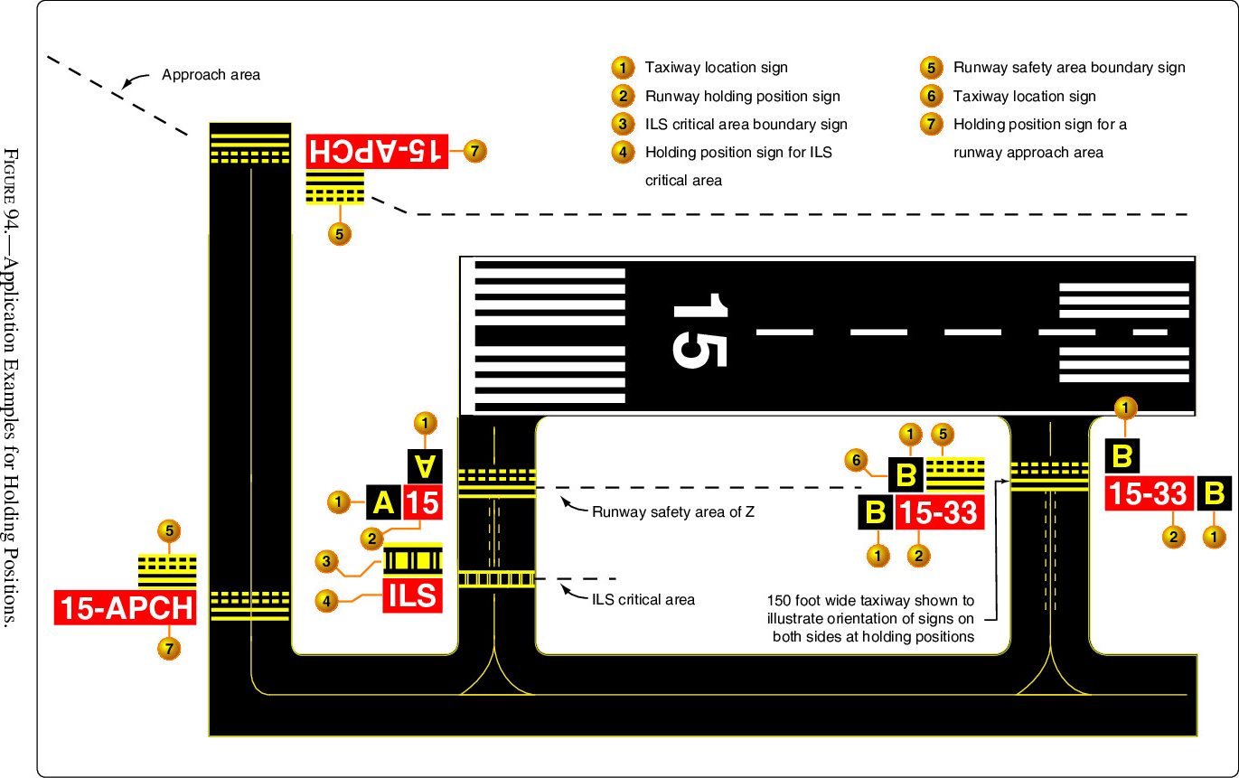
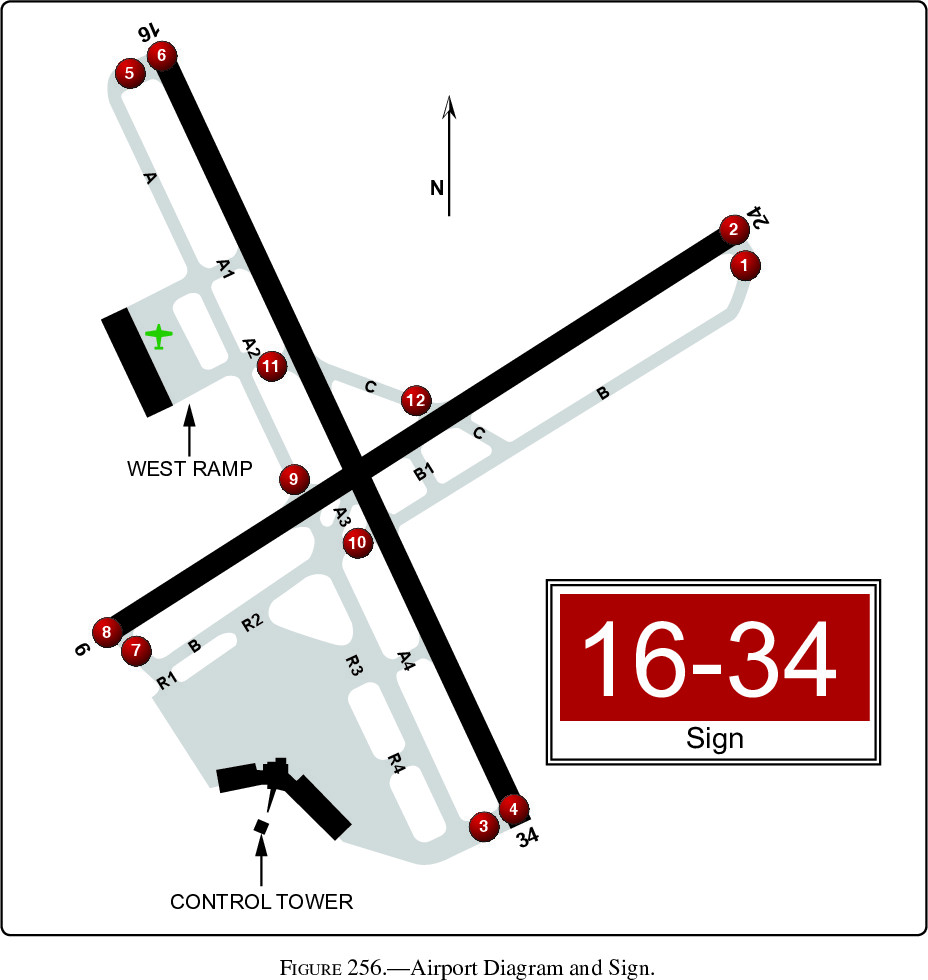
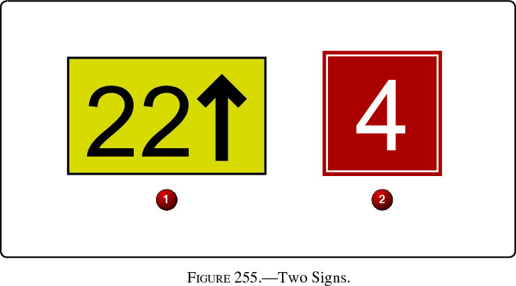
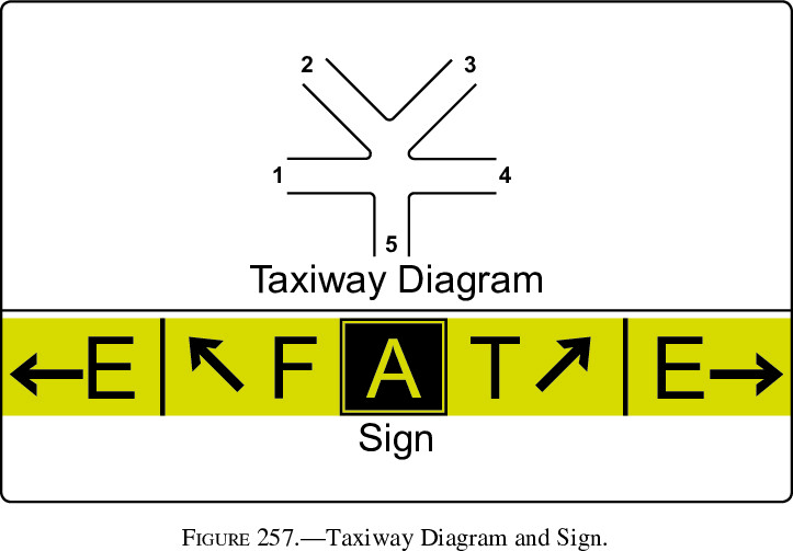
I found this particular figure useful for answering other sign-related questions (Figures 254-259).
AIM 2-3 and FAA Airport Quick Reference Guide are the best starting points if you’d like to read more.
Figures 254-259

Beyond Those 10
Charts
There are two reasons this post doesn’t cover SIDs, STARs, DPs, or airport diagrams:
- The variety of questions is too great to promise an easy point.
- Appendix 1 includes legends for all of these.
That said, it’s definitely worth knowing you’re way around these charts. The Instrument Procedures Handbook and AIM Ch. 5 are good starting points.
Appendix 1
Appendix 1 covers how to read the Chart Supplement, SIDs, STARs, DPs, airport diagrams, and IFR En Route Low Altitude charts.
It’s worth a slow read to familiarize yourself with what information you’ll have with you in the testing room.
The Other 186 Figures
I reviewed about half of the 196 figures on the instrument knowledge test before realizing this wasn’t the best way to study.5
For those I did review, though, I made notes on observations and useful resources to learn more. If you’re an instrument student (or just looking to refresh your memory), I hope you find them useful!
Please leave comments on any slides where you have questions or suggestions. Thank you!
What About the Plausibly Useful Idea?
That’s all I’ve got for this post! Good luck with your knowledge test, you’ve got this!
Jack
- Unless, of course, you’re the one stuck in the middle of the storms. ↩︎
- In order, they spell CIA: Cross-check, Instrument interpretation, and Aircraft control. ↩︎
- HSIs do not suffer from reverse sensing on a VOR. ↩︎
- As an aside, if you look at the cover of the latest AKTS, or at Figure 96 in the booklet, you’ll see the shading of the localizer appears backward. This version appears to be the older one, and it matches the HSIs in Figure 97. ↩︎
- Fortunately, my final study plan led me to a 97% pass! You can read more about that approach in my other post. ↩︎